
Wednesday, 30 November 2011
Thursday, 24 November 2011
POSTERS
 | |||||||
| this poster is very simple and blank. It shows off the main focus of the band and what kind of style they have they are also wearing different outfits. The colour scheme is all the same so you can tell its a group, it also helps adds to the style of them and the music. |


Friday, 18 November 2011
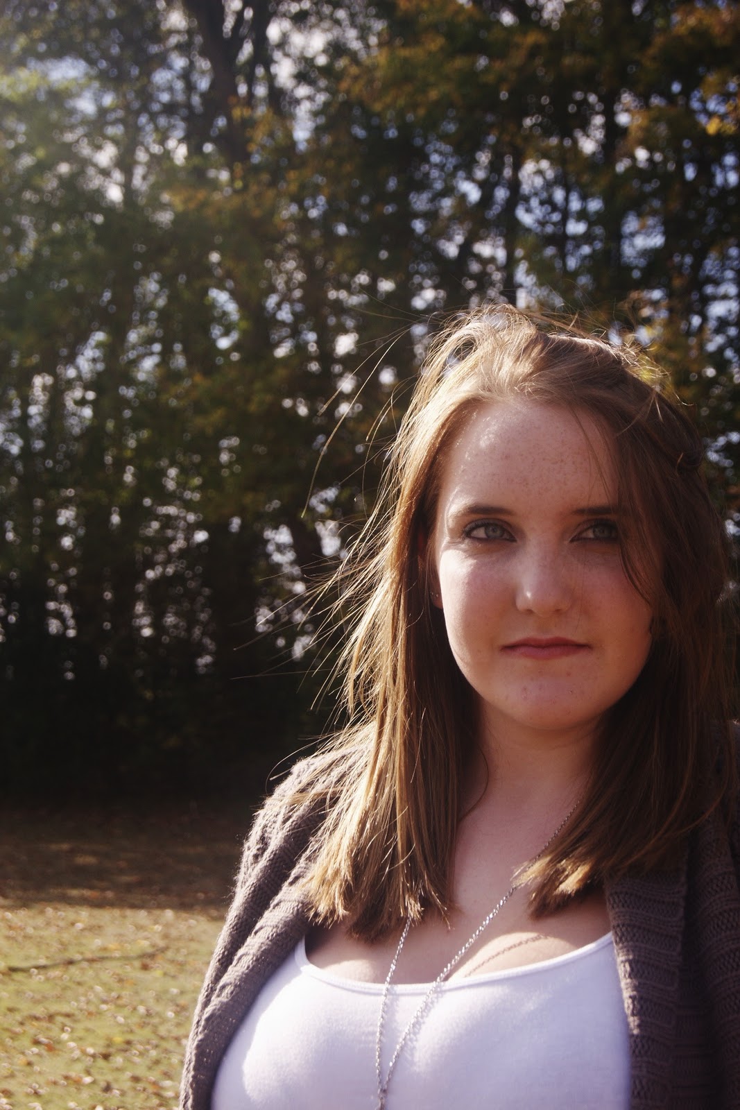
digi pack- photoshoot
- Since our first ideas we have decided to new pictures as the first shoot didn't really fit with our genre of music and so we have planned to do a shoot on Monday morning for Tuesdays media lesson.
- We are going to have a plain white backdrop, lighting and a fan to create a good affect to the photograph.
- We want to have makeup that stands out and is eye catching to the audience.
- We feel that our previous ideas for our digipack does not fit in with our theme and genre of our music

Ideas and research for digipak
As we have been focusing on creating a digipak that will fit the genre of our album, we have been researching album covers of similar artists (which have been posted on the blog) and we took photos of Catherine to edit and use on our digipak as we feel that a photo of the artist is fitting for our genre of music.
One photo shoot was done and the photos were edited and we felt happy with them, however after further research and brainstorming we have all decided to try another photoshoot with different background scenery to create a more modern feel.
One photo shoot was done and the photos were edited and we felt happy with them, however after further research and brainstorming we have all decided to try another photoshoot with different background scenery to create a more modern feel.
Initial Ideas
Before we had started to do any filming of our music video we made sure we had a thorough plan of the narrative and theme in which we wanted to convey through our music video. The narrative, costumes/hair and make-up, and location didn't differ from what we had initially planned to use for our video.
Our story boards are not exactly the same as the outcome of our video as we knew that we had planned to use quite a lot of shots, so not all of these were drawn up; however the locations on our story boards are all the same as the locations that we used in our final video.
Once we had uploaded all of our footage and were in the process of editing, we knew that we had more than enough footage and were happy with what we had, so we didn't feel as though we needed to spare some time to film extra footage. When we eventually finished editing our music video together and polished everything off, we decided that we would go out for 10 minutes and couple of more shots. This didn't take long as we knew exactly what we wanted as we had planned to put this clip in from the start.
One thing that we drastically changed about our music video from what we had originally planned to do, was the use of slow motion. Instead of adding the effect of slow motion for the whole of our music video, we decided that we would only make use of slow motion on the very last shot of the video.
Tuesday, 15 November 2011
Album cover

I really like the Leona Lewis album cover as its simple yet stands out because of the way she looks. it has a color theme of brown because of her hair, eyes and makeup all fitting together. Having her making eye contact directly at the camera makes a stronger image rather than having her turning away. Also, not having her smiling or looking too sad shows to the audience what type of music it's going to be and attracting a certain target audience. The text is also quite simple, basic Ariel text all in capitals, simple but still stand out above the image.


This album cover really stands out as everything is defined and in place. Her hair covering one eye having a perfect curve position and not one hair out of place. how the text covers this part of the hair i think creates a good affect and looks different from other album covers.

This Ellie Golding Album cover fits in with the theme of the name of the album 'Lights.' The way the writing has been edited to look like there lights lighting up in the letters and how it carry's on up towards the image of Ellie Golding with some of her hair glittering gold, also the same.
Most of these Album covers are close ups just showing the Artist face which i think we would want to do for our Digipack cover. Then it shows that it's purely just about the single artist and the way its show showing off their facial expression.
Tuesday, 8 November 2011
Song list (Digi pack cover)
- Crush
- Arguing
- Promise Ring
- Fed up
- Breaking point
- Remember me
- Speechless
- Love you more
- Writing a letter
- Whatever
- Just fine
- Time
- Pretty Girl Rock Featuring Drake
Monday, 7 November 2011
Target Audience
We thought that the song would be suitable for the younger audience, teenagers and young adults. As it's a love song it's not everybody's taste, but with the video and narrtive of ours, i think that this type of song would mean more to younger people and also it would attract more to girls than it would to boys. It's a classic pop song and i think it should be shown in the same way as the others. The song would be easier to show on music channels and played on the radio as it doesnt have any violence or swearing in it. In a way it's a cheesy love song with a video to match.
Review on Artist covers
The artist covers shown on the blog are the types of style we are going for, they relate to the right genre of the music video we are doing. They are very bright and colourful or focusing on one colour. They all focus on the artist on the front of the cover in some way or another, you rarely see a female solo artist who isn't on the cover of their own album so we are going to stick with that theme. We took photos to go on the cover of our digi pack which are also on the blog.


Research on Special Effects
Nowadays probably more music videos feature CGI and special effects than don`t. Visual Effects and 3d animation are a great way to create a stunning and original look for your promo, and because CGI allows you to do more than ever before – even if your budget is measured in thousands rather than tens of thousands of pounds– the opportunities for using post production effects in your music video promos are greater than they`ve ever been.
One of the reasons for this is that video effects artists and animators tend to see music videos as a way to try out new visual effects ideas and techniques that they don`t usually get the chance to use in more tightly controlled, and higher budget video productions for TV and film. They get to be more creative, and can often suggest their own ideas of how to use new cutting edge FX techniques that even film producers aren`t yet aware of. If you`re prepared to be flexible, then you can often get a good deal on some really impressive visual effects.


Analysis of students work
http://www.youtube.com/user/longroadmediastudies#p/c/90B97A72C742C076/17/rm2p9fgOeEs
Location
I really like this location as its completely different from other videos that i have been watching. Its more eye catching with the grafitti and run down look aout teh place. It creates a sense of loneliness in the video which suggests that this is the couple acting in the video. It seems abandoned and away from teh main of the city, showing taht teh locationwas thought about well and the shots are purely based on each chracter and their surroundings.And it also looks like a real music videos choice of location.
Coastumes
I thought overall teh costumes were good as they fitted in with the mood of the song. They were not over the top like they are in more up beat songs, they were simple yet noticale to the audience. However i do thinkthere could have been a costume change from the girl when she is being filmed in a different part of the location so she had 2 cosumes like the male, on teh other hand this could have een done so it looks like just one day instead of showing timepassing in thair music video.
Effects
I really like the way they have shown time passing quickly y speeding up teh footage of themwalking around through the arch ways and mving spaces on the sofa. I think its fits in with the music well when there is no singing and just generally looks good and effective to me the audience. Another effect, where there rewind the footage of them spray painting the wall, it creates more of a narrative to the story with what they write without having to have the narrative actualy being shown by the chracters acting it out.
Filming/ Shots
I think the music video does an excellent jo of showing off the location to the audience, by showing long shots and close ups of parts of the place with no people. Showing empty food wrappes, drink bottles, wheel of a bike, missing flooroards and bits of rubish really sets the scene and gives off ideas about the music video itself and the atmousphere they were trying to potray. Theres a take where boteh chracters sit in a archway individually one at a time, th girl sitting teh middle then the boy sitting more to the left. They fade one in as the other is fading out which i thinklooks rea;lly good asit suggests that there not there together yet there singing to each other.
Lip singing
It looked like they had learnt the song well as tehy seemed to know the words and it fitted well with the footage.
Thursday, 3 November 2011
Music video Anlysis
JoJo- Disaster Music video
http://www.youtube.com/watch?v=B9rGNfJmXRc&ob=av2n&noredirect=1
This music video shows both love and anger within the lyrics and narrative. There are signs of attitude in the video and also sadness creating ups and downs thrughut the narrative and performance.
The performance side of the music video is mainly shot in close ups, extreme close ups and medium close up. We decieded to the same as we think it shows more emotions and facial expressions from the artist creating more realistic atmosphere of the video.
It also uses short and snappy takes from the narrative point of view showing the main points that the audience would want to see so we know exactly what is going on and dont get confused with the storyline.
The Start of Editing
We started editing our music video after we shot all the footage for it. We were pleased with how much footage we got as it made it easy to pick. We decided that the video should be fairly fast paced and so did a lot of cuts between two takes. We have mixed all our locations up to keep the video interesting for the audience to watch. We put in a black and white background on the green screen shots which seems to have worked well, it also makes it interesting to watch and identifies the fact it's not the narrative. We have taken the feedback from class mates and are working on improving the video to make it more understandable.
Feedback from our draft
Positive Feedback:
-Good Performance
- Good use of close-ups
-Nice black and white
-Good pace of clips
-Nice range of footage
-Good lip sync
Negative Feedback:
-Didn't see where the narrative was going
-Needed more location
-Got too pacy at the end
-Close ups where at the same range
-Good Performance
- Good use of close-ups
-Nice black and white
-Good pace of clips
-Nice range of footage
-Good lip sync
Negative Feedback:
-Didn't see where the narrative was going
-Needed more location
-Got too pacy at the end
-Close ups where at the same range
Subscribe to:
Comments (Atom)